New Yorkers of every ilk have diner rituals: solitary morning counter coffees, convivial weekly lunches that span decades, late nights crowded into booths to soak up libations. Still, even the most storied traditions must evolve with the times. Enter Nickel & Diner, a classic American five and dime-meets-diner, reinterpreted from a modern perspective.
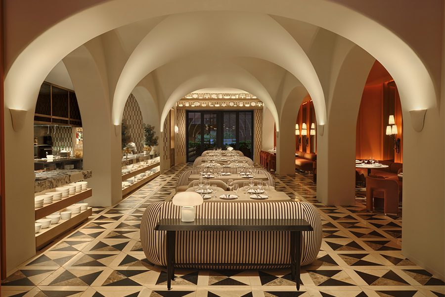
The challenge for New York designers William Oberlin and Larah Moravek, cofounders and principals of Dutch East Design, was updating that nostalgic standard without losing authenticity. After all, Nickel & Diner is not only a contemporary take on a classic 1920s diner (the heyday of such establishments), but it’s also a culinary destination, serving elevated fresh and local cuisine. “There are certain elements of a diner that are universally understood: a pass-through counter, open kitchen, Pullman-style booths,” explains Oberlin. “The trick was employing those big elements then putting our own twist on it.” One example is a corridor’s traditional wainscoting, but here, vertically laid black half rounds feature a repeating Art Deco-inspired detail: the designers painted a series of the dowels white at varying lengths.
The melding of two hospitality styles wasn’t the only directive to consider in the gut renovation. The designers were also asked to reference, with restraint, that Art Deco style, as well as the Chinatown location and its heritage as a former Chinese buffet. On the retro front, the team focused on geometric and graphic details everywhere from tabletops and wallcoverings to stainless steel lights over the bar, created from Shell globes—a nod to 1920s cars. Greenish-blue upholstered booths and chairs, as well as walnut wood finishes on the booths and the ribbed fronts of the coffee bar and the host stand, add a pop of color and texture to the otherwise monochromatic black and white palette. “We articulated space that way,” explains Moravek of the color scheme. “The main dining ceiling is matte black, whereas the coffee bar ceiling is white.”
The Chinese elements are even subtler. For instance, there’s a modern day Chinatown-inspired toile wallpaper wrapping the private dining room, and traditional Chinese serviceware and ceramics are used for plating. It’s the exterior of the building that is perhaps most pronounced. Here, the designers did little to compete with the original ornate façade except at street level, where they dreamt up an enticing storefront for passersby, courtesy of portions of ribbed and clear class. “We’re close enough to the West Village that the Ed Hopper painting Nighthawks suddenly becomes relevant,” says Oberlin, who notes that large windows are fairly standard for classic diners. Adds Moravek: “We thought a lot about where to place light fixtures and what you’d see from outside, so you get all this diffused light. From the street at night, the whole restaurant looks like a lantern.”