Dating as far back as the 14th century, Italian osterias served as modest, rustic eateries emphasizing quality ingredients over a theatrical atmosphere. The simplicity and warmth of the historic dining tradition is now celebrated in the contemporary atmosphere of Vancouver’s Osteria Savio Volpe. The wisdom at the heart of the 75-seat restaurant is embodied in its mascot—a hungry but unmistakably debonair Italian fox.
Craig Stanghetta, a principal at locally based design firm Ste Marie and one of the restaurant’s owners, was eager for his concept-driven firm to establish a social hub for the city’s Fraserhood district. The Ste Marie team worked from the studs out, constructing a base building envelope with the help of local firm Scott & Scott Architects. Once the bones were in place, the design came to life.
“We challenged ourselves to use as many different colors, materials, patterns, and textures as possible, but to maintain a muted and earthen palette,” Stanghetta says. “The benefit is rhythm and visual interest while maintaining a sense of modernity and harmony.”
Aiming for both playfulness and practicality, the team looked to the modernist work of Italian artists and designers like Bruno Munari, Enzo Mari, and Carlo Mollino to steer the vision.
“We leaned on a lot of earthy and honest materials,” Stanghetta adds. “At the same time we appreciate the Italian sensibility for its boldness and irreverence.”
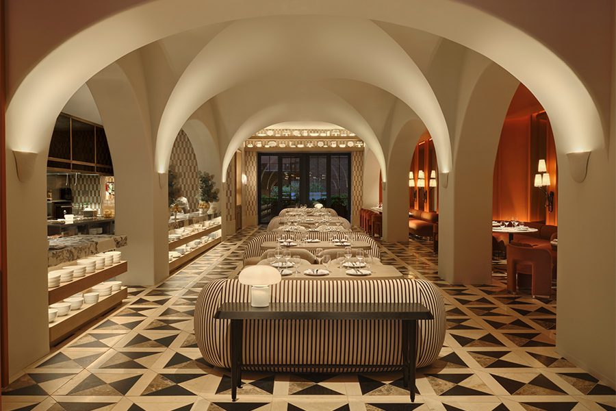
Subtle in color, a mixture of quarry tiles first establishes the interior’s natural character, while homey details and accessories create a warm and relaxing atmosphere in the ample interior. A woodfire grill in the open kitchen accentuates the space’s farmhouse quality, along with custom shelving filled with books, preserves, glassware, and even logs.
A happy medium between banquettes and booths, the osteria’s bench seating allows for both density and versatility. The overall muted palette is balanced by the benches’ sartorial upholstery, the patterns of which Stanghetta says would be the mascot’s fabric of choice for a suit or kerchief. Pervasive use of pleated red oak on the walls helps create not only a sense of place but of time, calling to mind 1970s-style wood paneling.
“We loved this material for its sense of rhythm and texture, but we wanted it to conform to a more modern application so we added breaks and borders,” says Stanghetta. “It’s a great backdrop for colorful artwork.”
The eclectic art selection also amplifies the restaurant’s whimsical energy. Twin prints from Edoardo de Falchi, punctured by matching custom light fixtures that reflect back on them, are focal points, as are bucolic murals by Munari.
The standout for Stanghetta is the central bar, surrounded by 18 stools in alternating tones of walnut and white and red oak. The functional centerpiece adds a kinetic quality to the room without overshadowing the eatery’s many other charming highlights. In fact, the project’s diverse touches are the design firm’s signature.
“It’s quite deliberate that we avoid theme or uniformity in content. Our studio finds that kind of thing overworked and lacking in dimension,” Stanghetta explains. “Like a good life, a good design deserves some complexity and contradiction.”